Litebox designs a blueprint-inspired brand system for GBOX’s AI agent infrastructure
GBOX had the product but not the identity. Its site borrowed from the same shorthand every AI infrastructure company uses, and nothing in the visual language signalled what makes the platform distinctive: it builds the environments agents actually run in.
With this in mind, we defined the following project goals:
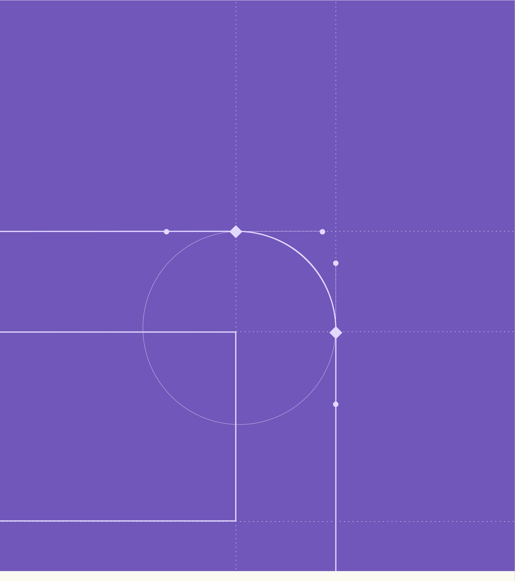
We started by deconstructing GBOX’s existing identity and mapping the competitive set, then narrowed two moodboards into a single direction: blueprint. Technical line work, dot grids and isometric construction: the language of something being engineered rather than decorated. From there we pushed the grid into three dimensions, so the background stops being a backdrop and starts reading as the inside of a box.
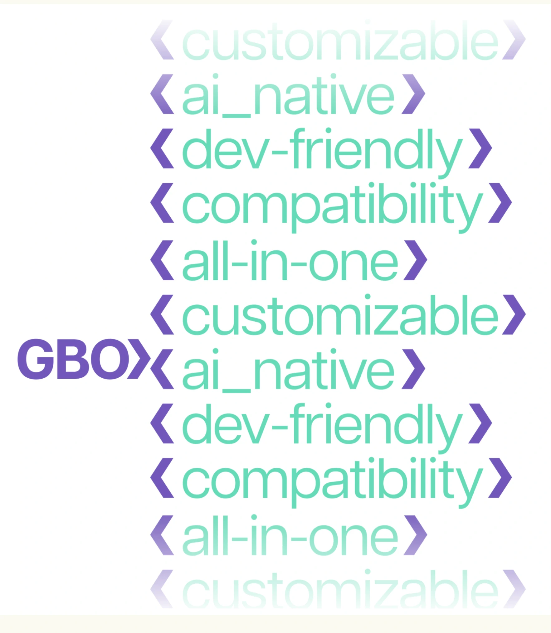
The logo went through more rounds than any other piece, and the brand is better for it. GBOX kept asking for the box to be more present, so we stopped treating it as a mark and started treating it as the system. The result is an isologotype and an isotype, each available in outline and solid: the same object seen as a transparent plan and as a finished build. Rotate it and the angular brackets of code form an X across its faces.
A brand only works if the team can run it without us. We documented the system in a brandbook delivered as both an interactive prototype and a PDF: typographic rules for UI, minimum logo sizes for favicon and interface use, and custom colour names so no vendor ever confuses “the green one”. Alongside it we shipped logos in every format, isometric illustrations, a pixel icon set, background grids, animated GIFs and the editable After Effects files.
GBOX’s goal was to look like the serious infrastructure layer it is, without losing the character that makes developers pay attention. By turning its own name into a coherent visual system, we gave the team an identity that scales from a 16px favicon to a rotating 3D hero.
Our impact looked like:
This project is a great example of how Litebox helps AI infrastructure and developer-focused companies sharpen their positioning through brand design.
If you need a team by your side who can help you position yourself for growth, Litebox is ready to roll. Reach out today.
Most infrastructure brands reach for the same shorthand: dark backgrounds, purple gradients, abstract nodes. Distinction comes from finding something structural in the product itself and committing to it. For GBOX that was the box: one object that became the logo, the grid, the illustration style and the motion language.
Because a brand has to keep moving after the handoff. Motion specs and editable After Effects and source files let the GBOX team spin up new animations, social cards and product UI on their own, extending the system instead of freezing it at launch.
A complete visual identity, with no marketing site or software development: logo system, typography, colour, illustration and iconography, plus a documented brandbook and the source files your team needs to run it. We scope it to what you need to launch and grow.