Bugster
How Bugster’s brand caught up with its autonomous QA agent.
Bugster is opening a new category between PR reviewers and end-to-end testing, aimed at individual developers. Its identity needed to match that ambition and stand out from the dark-mode, shadcn-style sameness most devtools default to. To support the launch, we defined these project goals:
Bugster in Action: Real Results, No Test Files
With Bugster, teams catch bugs before production —
Reduction in post-release bugs
Faster QA cycle time compared to manual review
Manual test files written
80%
4×
0
Testing That Matches Your Speed
Bugster runs tests automatically as part of your workflow—
Tested Where It Lives
Bugster evaluates your app in GitHub PRs, Vercel previews, localhost, or staging—
Only Real Issues, Right in Your PR
No noise. Bugster comments on PRs only when something's broken—
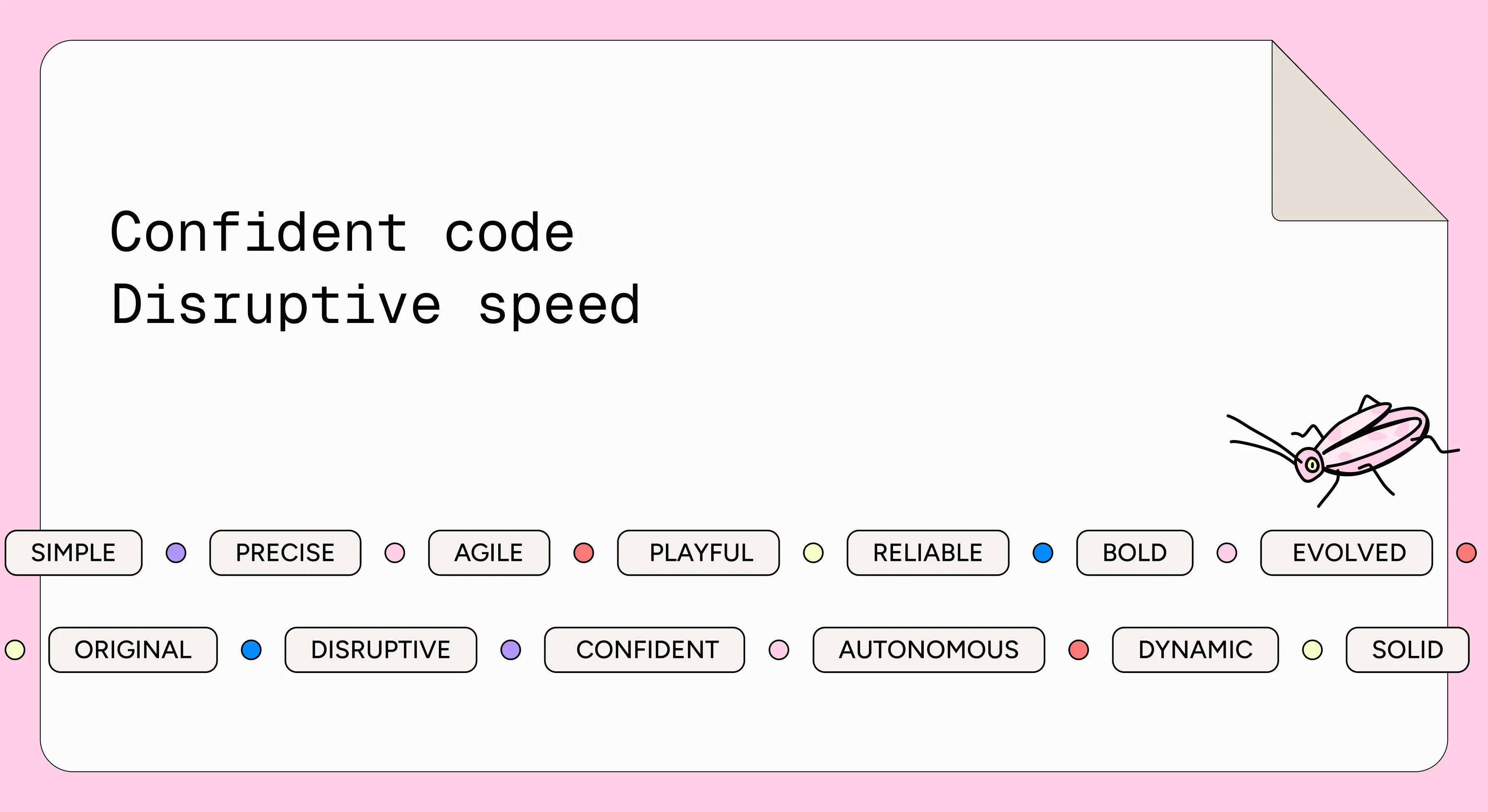
Bugster needed a brand that blends into a developer’s workflow while feeling sharp and playful, so we started from the spirit and anchored the identity in four values: autonomy, clarity, seamless integration, and developer-first design. Taking cues from brands like PostHog, we gave it a system with warmth and a point of view.
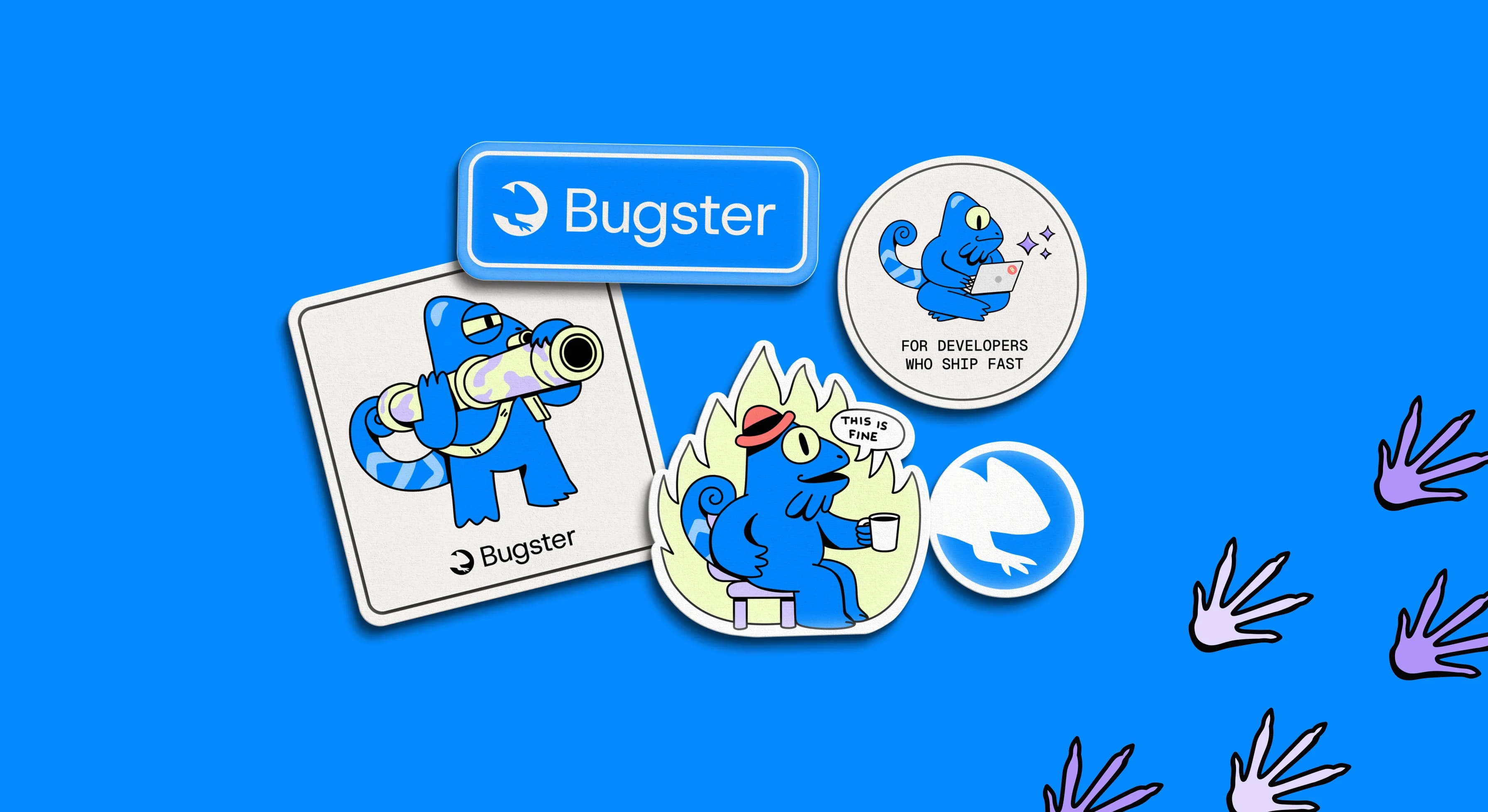
Bugster’s promise is adaptation, so the mark carries it: a chameleon silhouette in bright blue that blends in and stands out when it needs to. A clean sans-serif wordmark adds readability, and the icon works with it or alone across UI and favicons.
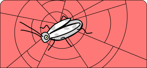
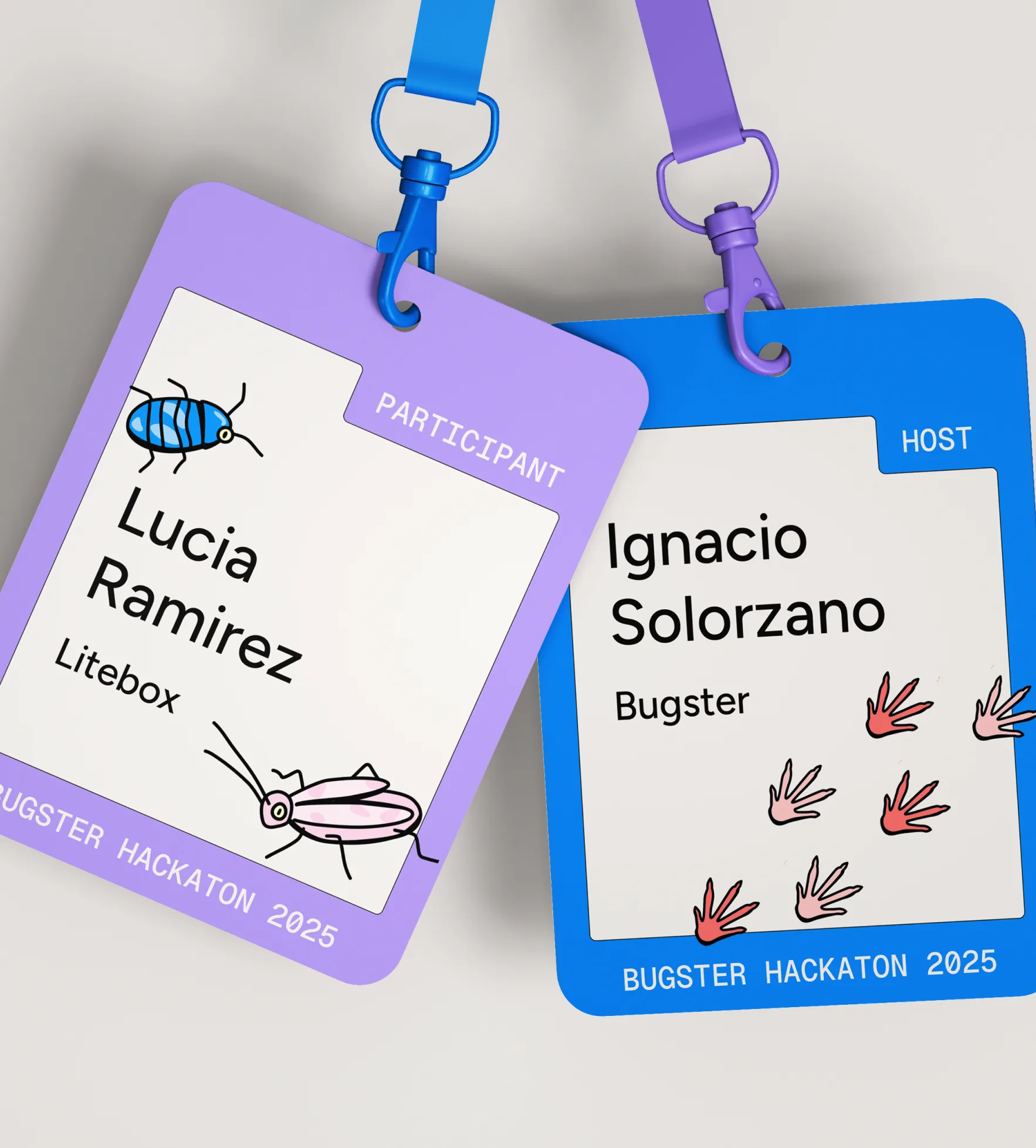
To humanize a technical product, we created a character: a curious, clever QA companion who spots bugs with sharp instincts in his digital jungle. Agile and observant, he brings personality to technical tasks and works across marketing and UI, with supporting illustrations extending his world.
Heading into launch, Bugster needed a brand its team could run on its own, so we documented the visual system and its applications, from favicons to merch, in clear guidelines and handed over editable source files.
Bugster came out of the project with a distinctive identity centered on a chameleon mark and a character, giving a technical product personality and credibility.
Our impact looked like: